The Alexander Grass Campus for Jewish Life
The Alexander Grass Campus for Jewish Life

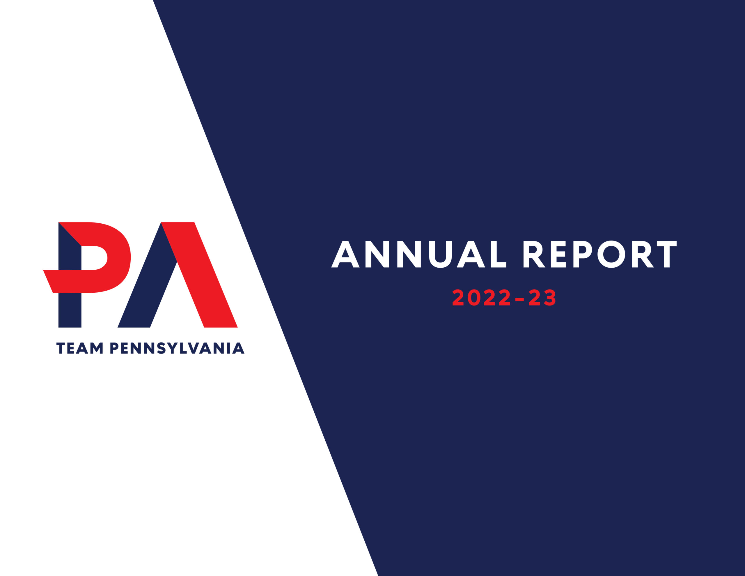
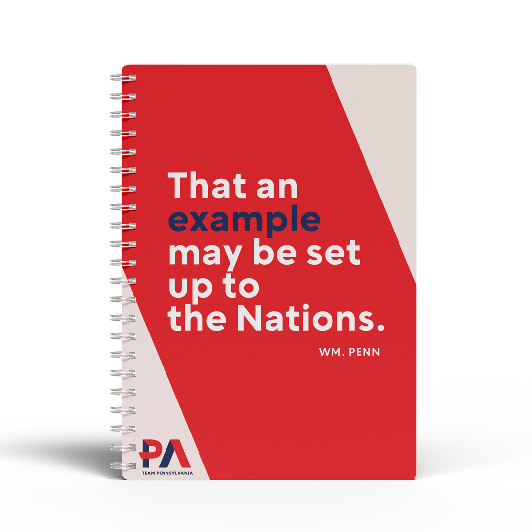
Team Pennsylvania
It's no secret that branding agencies (like us) love ourselves an opportunity to rebrand an organization.
It’s partially the relief of avoiding working within the constraints of another agency’s decisions and designs and partially the satisfaction we get from updating, fixing, or improving someone else’s work. In 2022, we were provided a rebranding opportunity that was different from anything we’d ever encountered because the previous agency was … us.
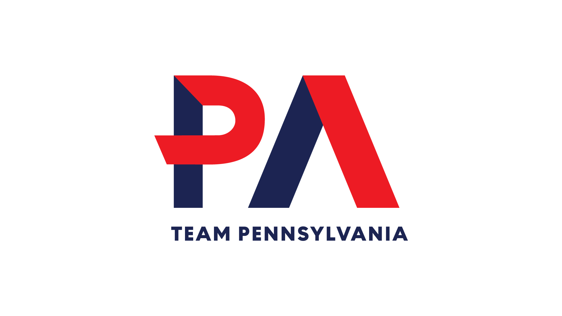
Back in 2015, we’d developed a brand for Team Pennsylvania, then a understated non-profit working dutifully behind the scenes to facilitate public/private partnerships to move Pennsylvania forward. Fast forward five years, and a new president took over the helm pushing the organization firmly and boldly into the forefront. The new Team Pennsylvania was driven and assertive, setting their own agendas and priorities and taking confident action — setting the standard for progress in Pennsylvania.
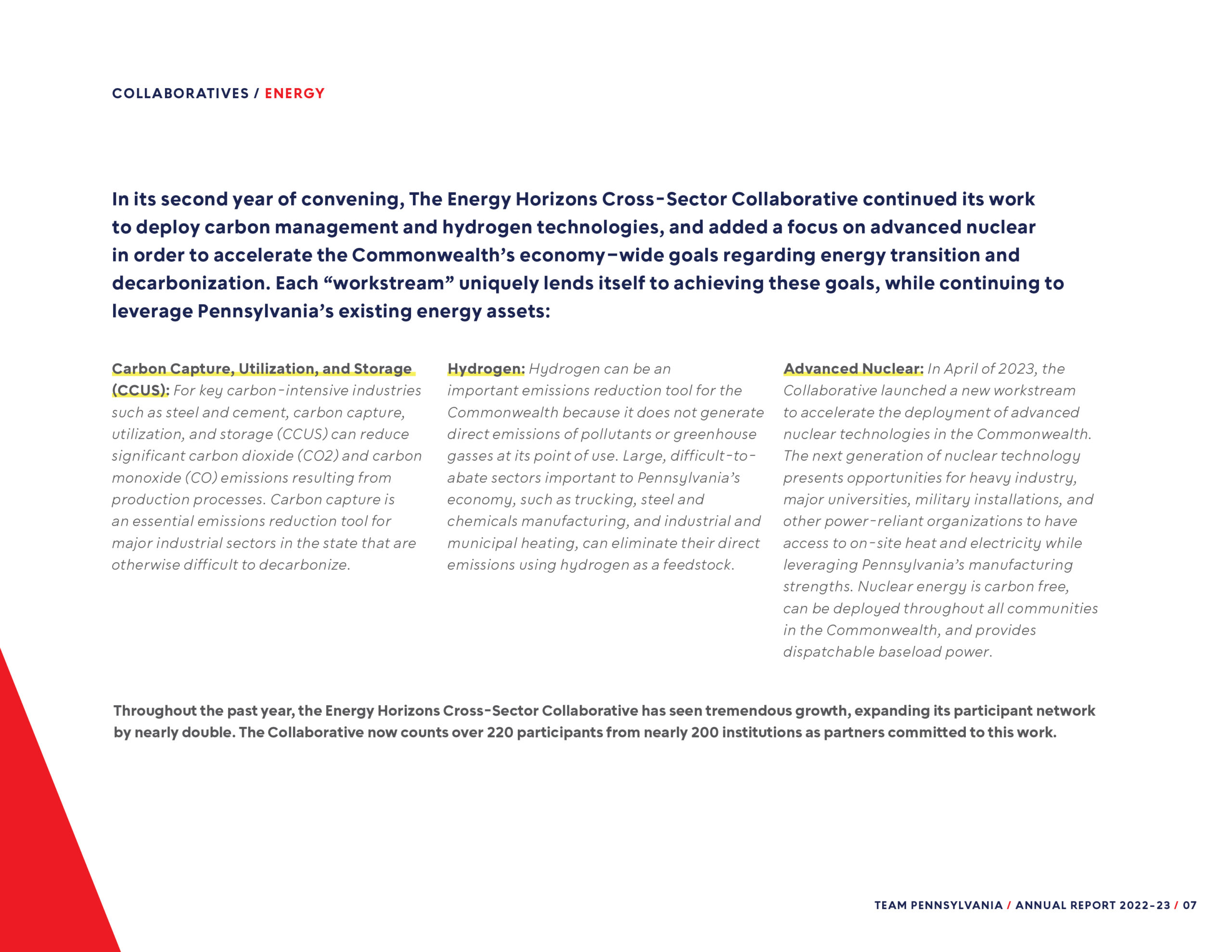
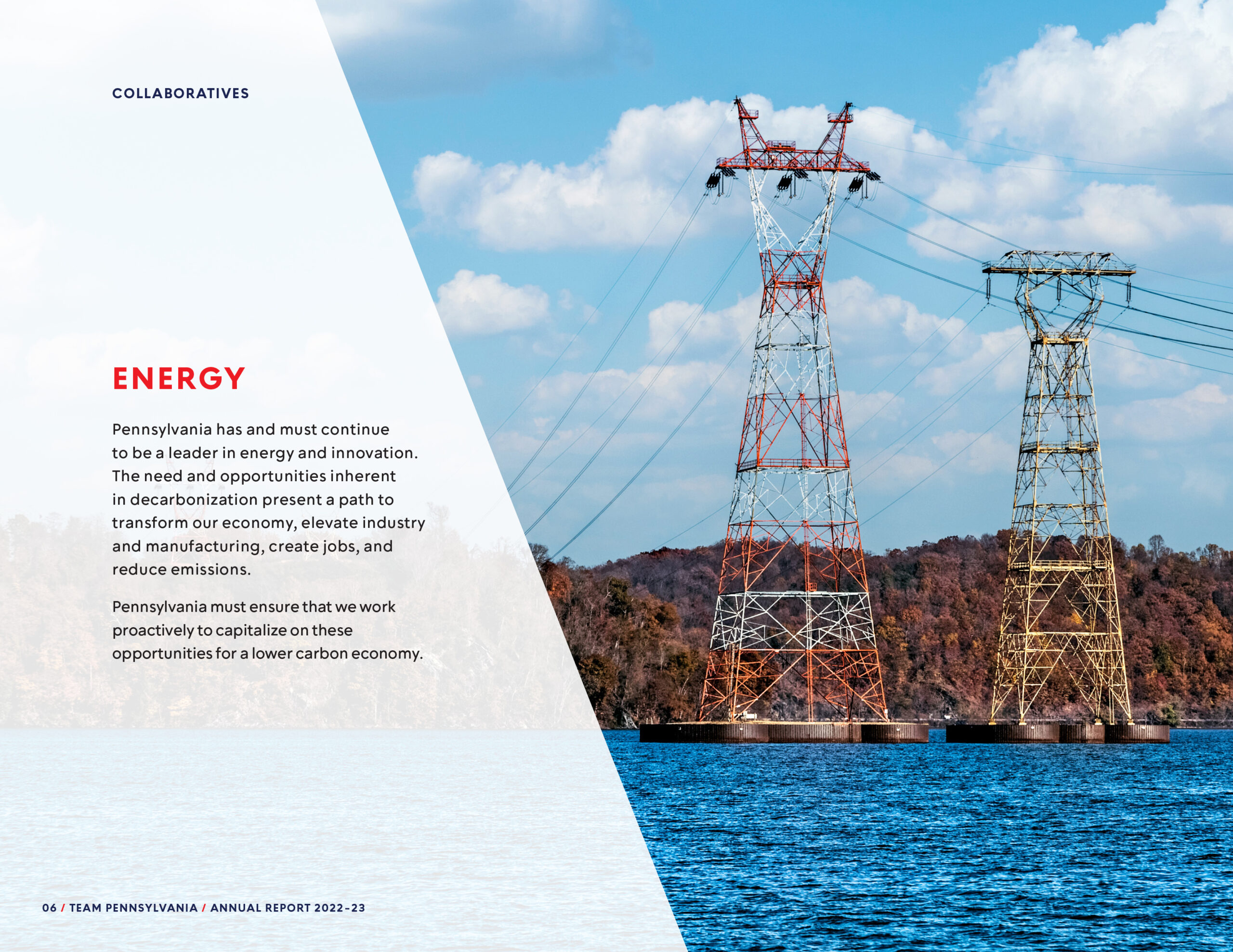
Industry
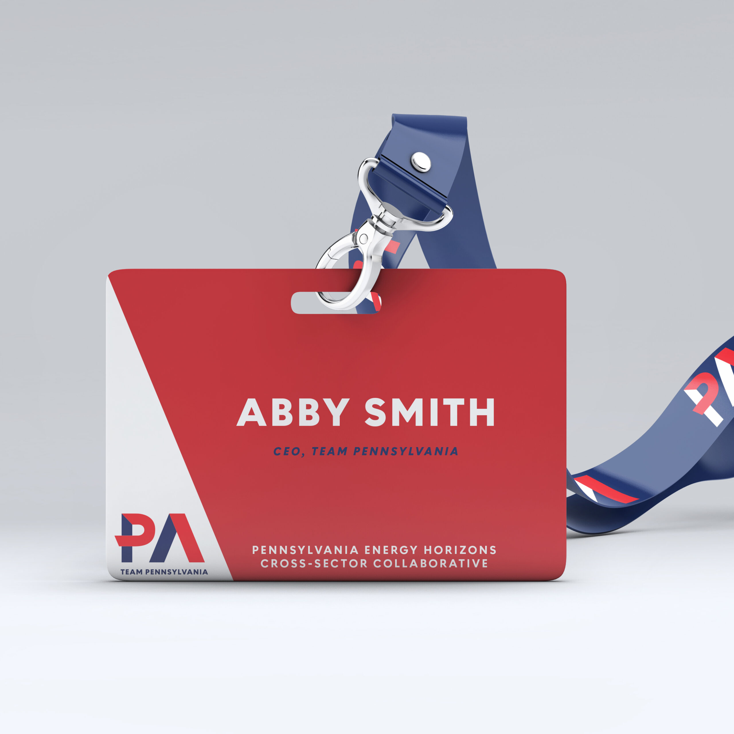
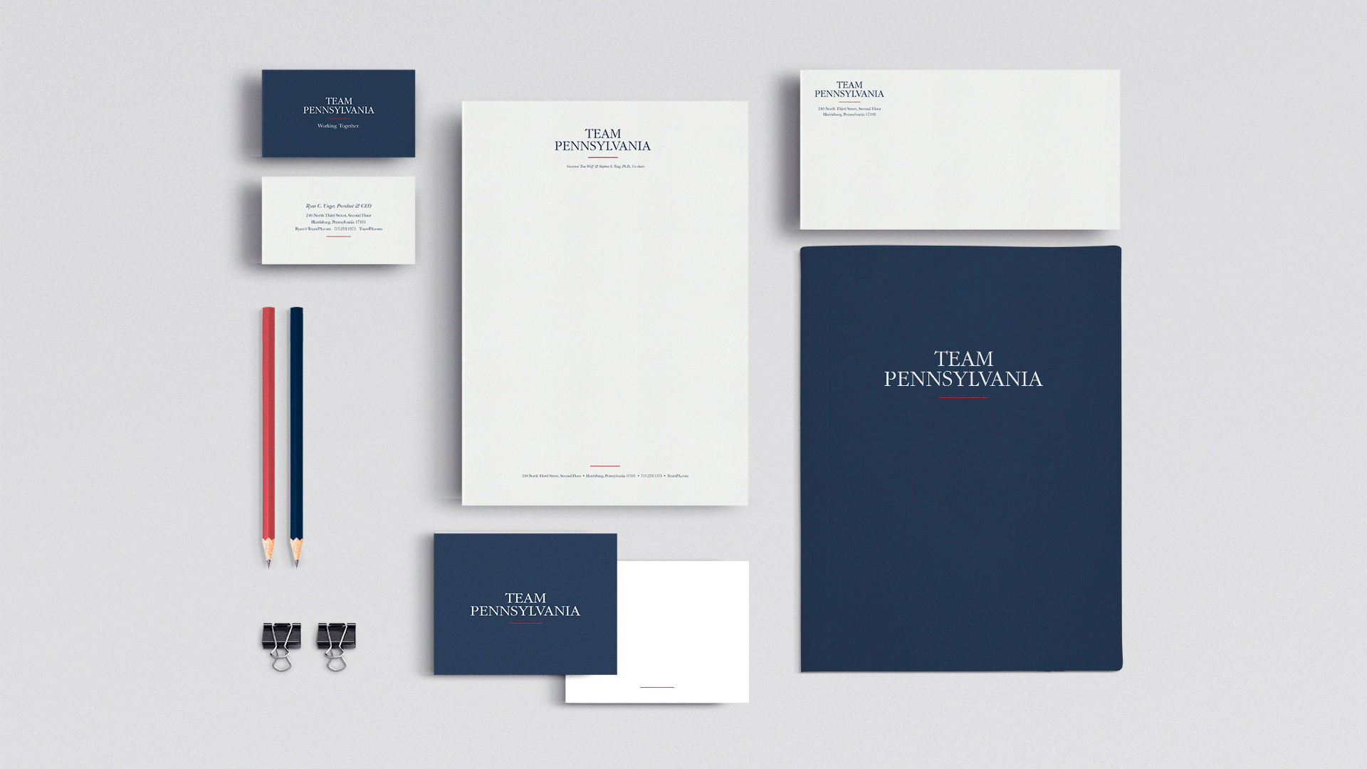
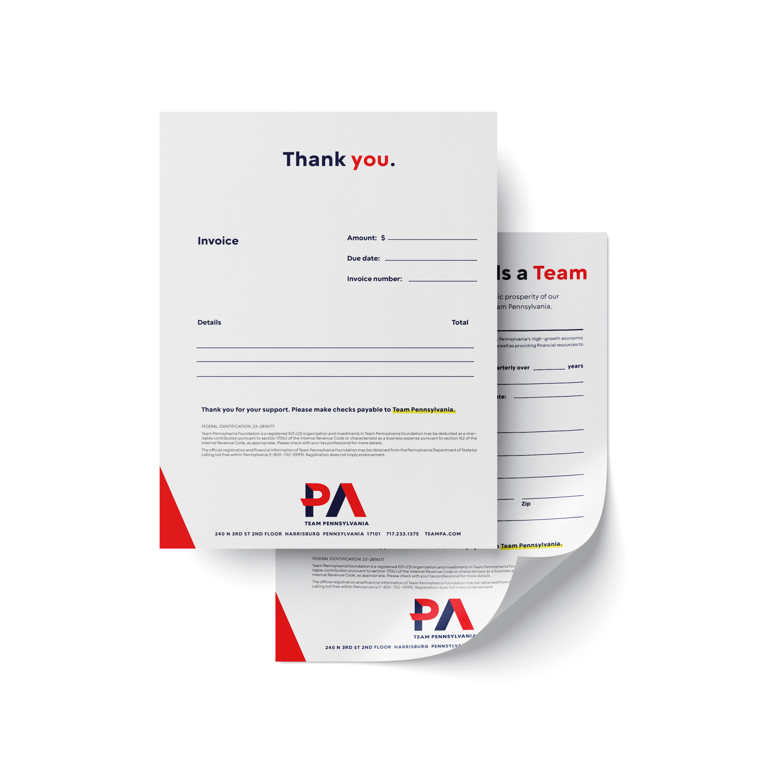
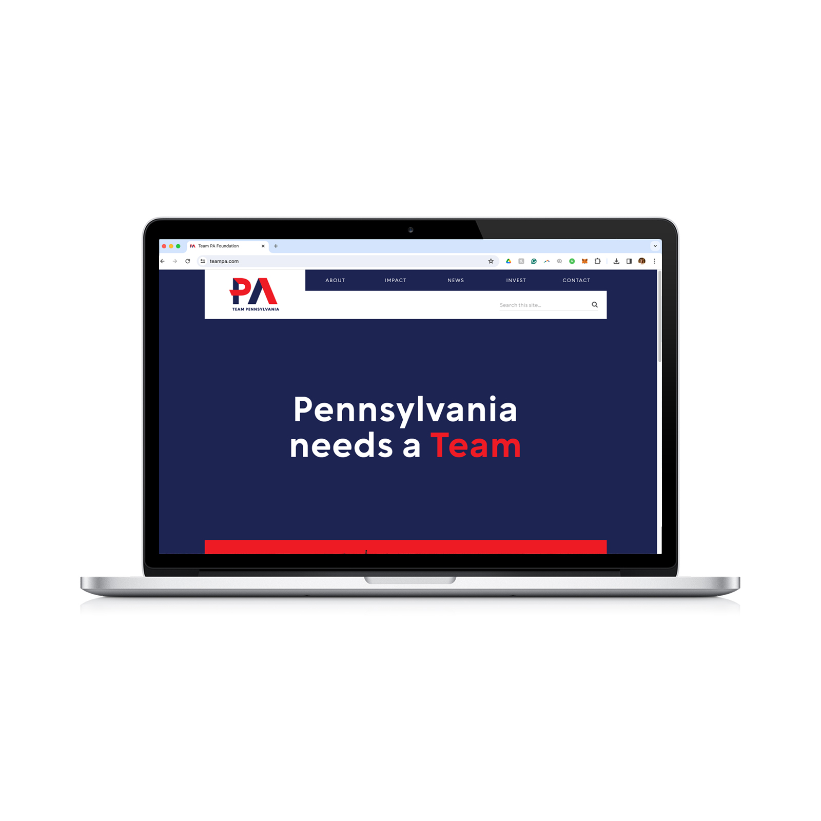
Components
First, let’s take a moment to appreciate (and bid farewell to) the identity that Team Pennsylvania was ready to shed. It was nice, right?

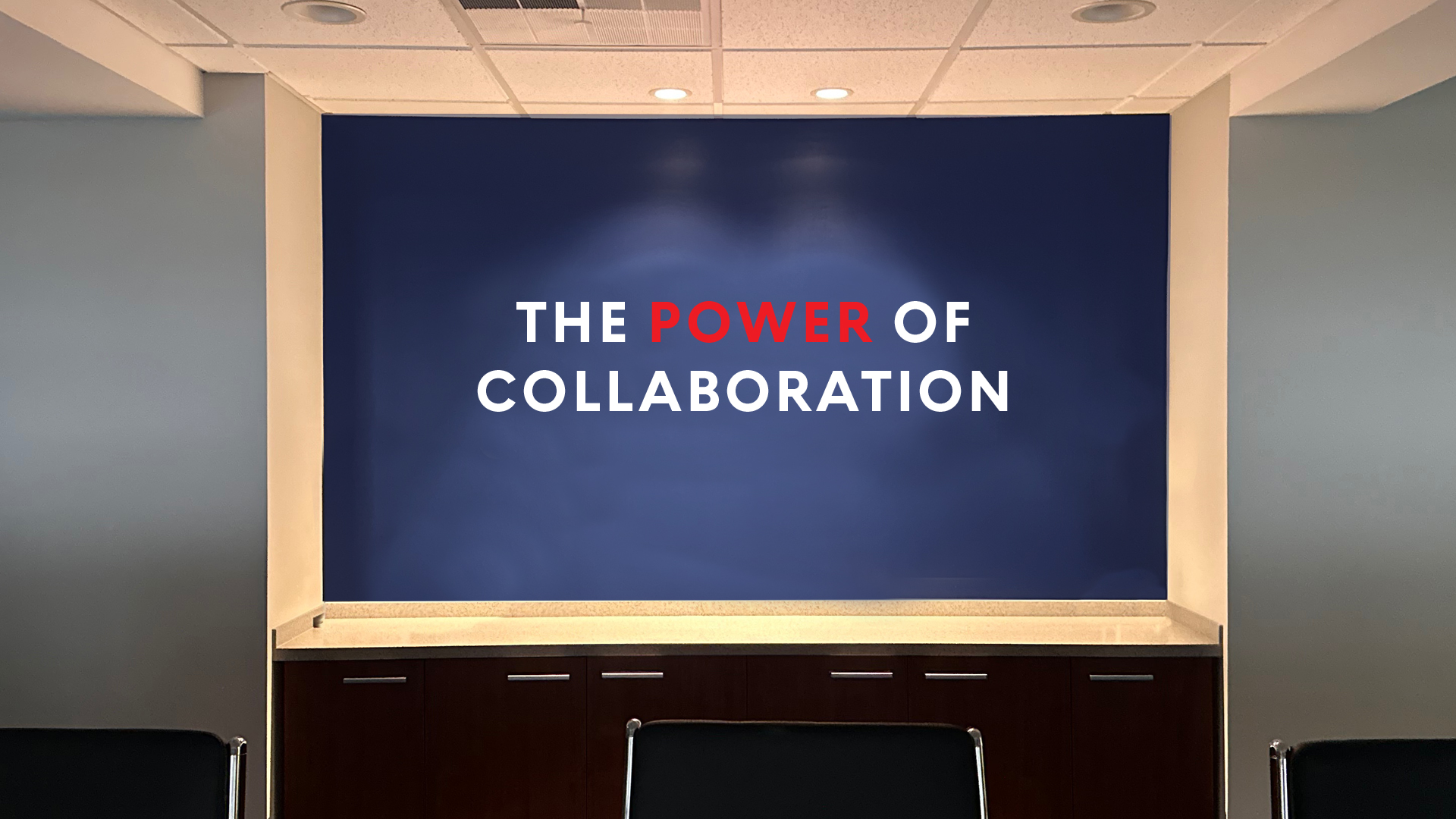

Proud Moment
When you ask a branding agency (again, like us) to share the highlight of the branding process, it's pretty rare to hear the words "board meeting".
But … allow us to tell you about the board meeting. When the new brand was revealed, it was met with unanimous support and enthusiasm. While we were pretty proud of ourselves for creating a strong strategy and compelling design, we were equally proud of our client for having the vision, leadership, and discipline to roll out the brand the right way.
The new look was presented as an essential evolution that boldly and accurately represented the organization’s operational shift – already in motion. The lockstep alignment between the organization’s function and form made for one of the smoothest and most solid brand rollouts we’ve been lucky enough to be a part of.