Crane Chinatown
Crane Chinatown

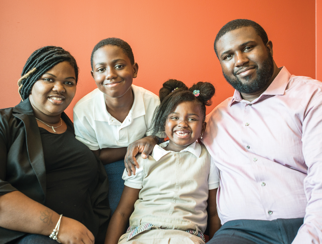
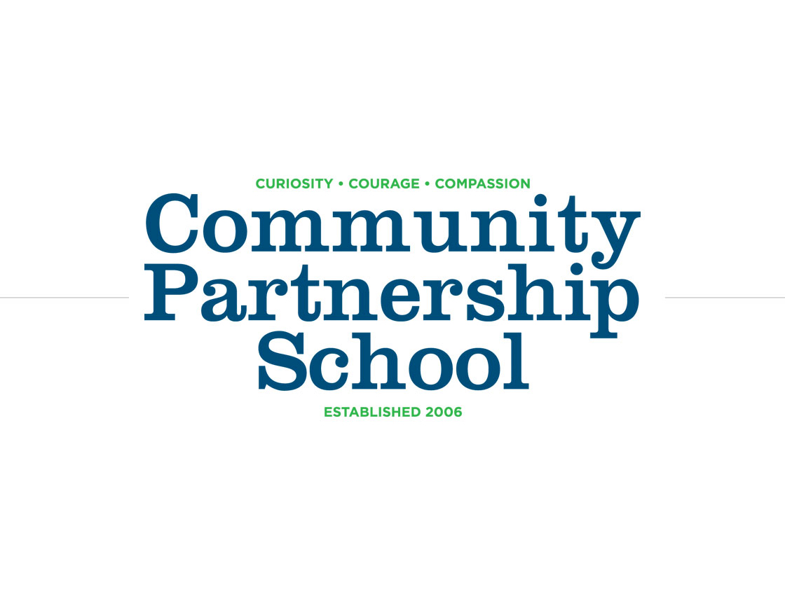
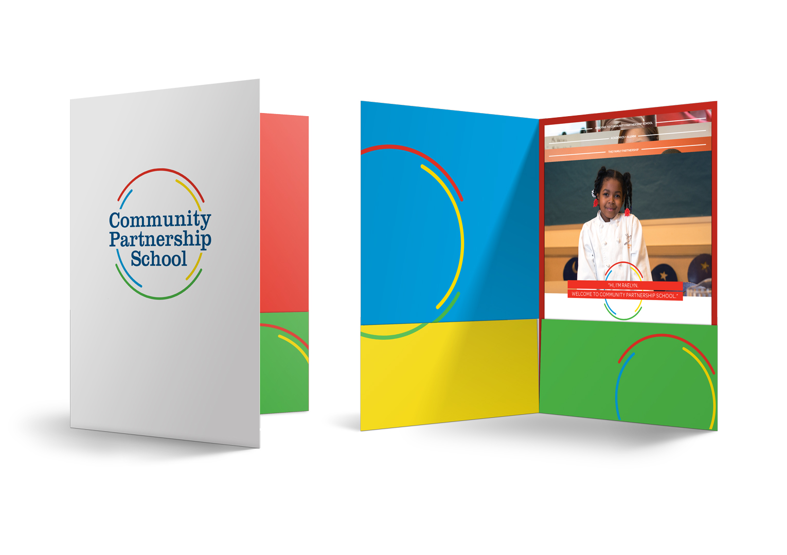
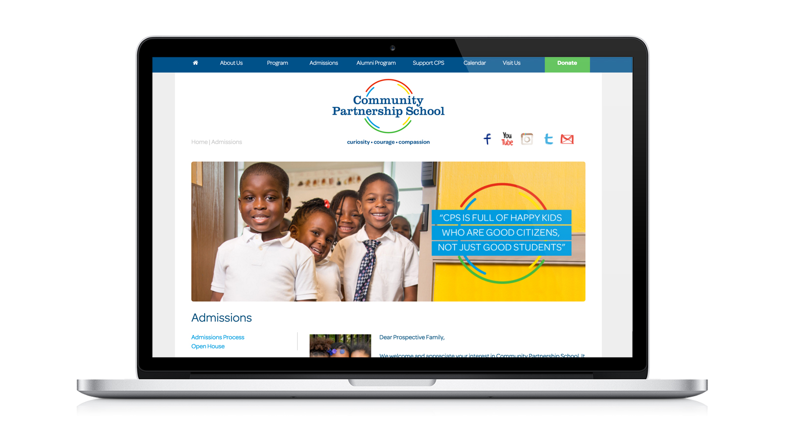
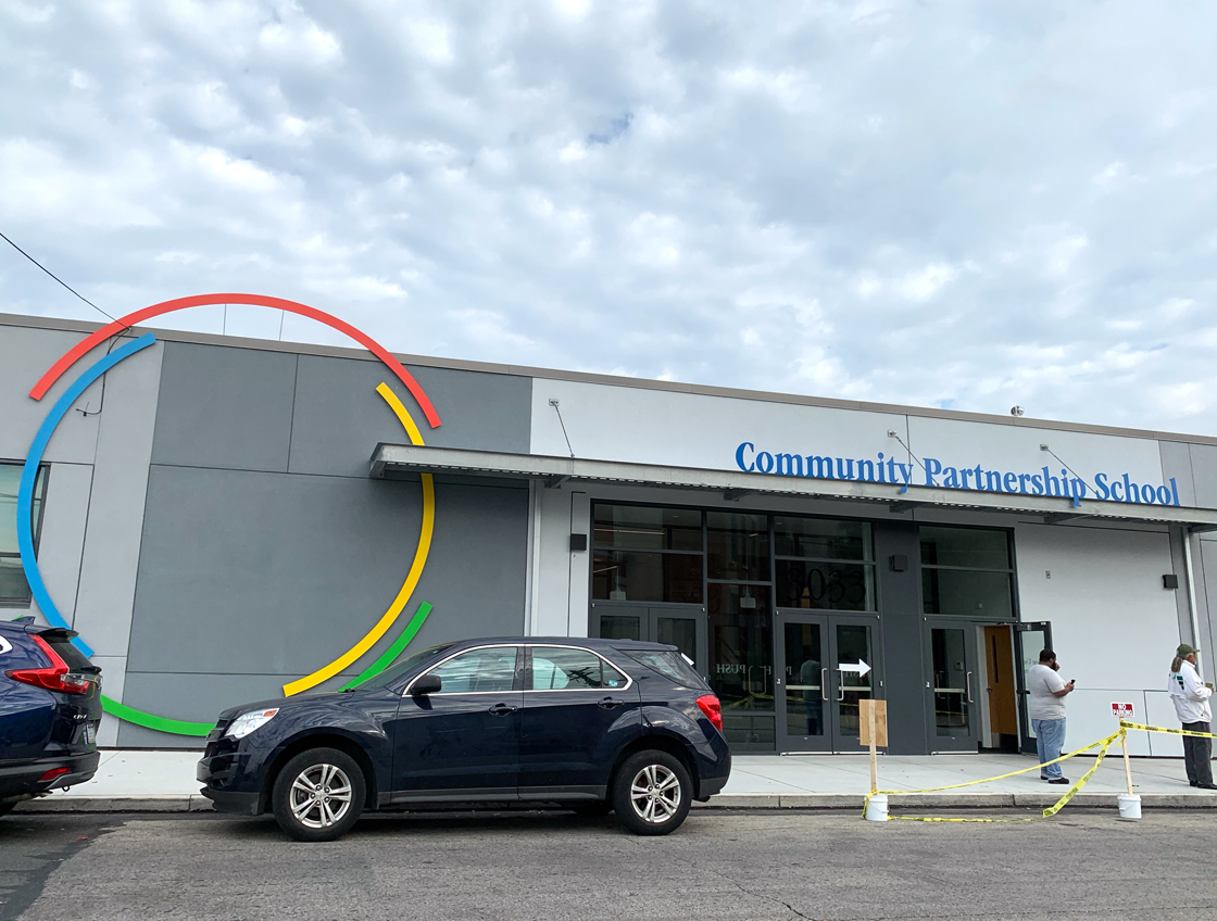
Community Partnership School
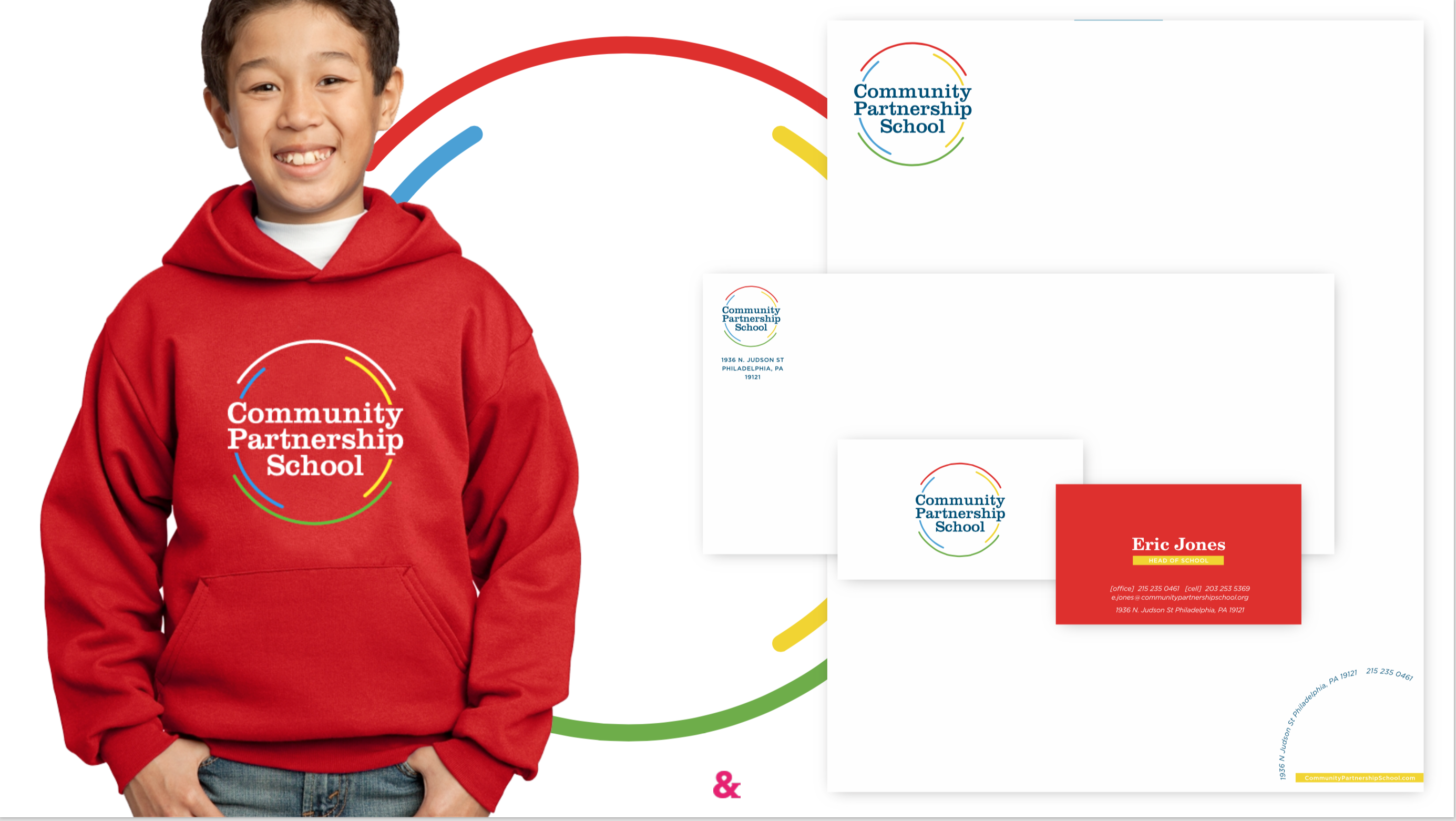
In early 2015, we raised our hands and were called on to develop a brand identity and messaging strategy for Community Partnership School in North Philadelphia.
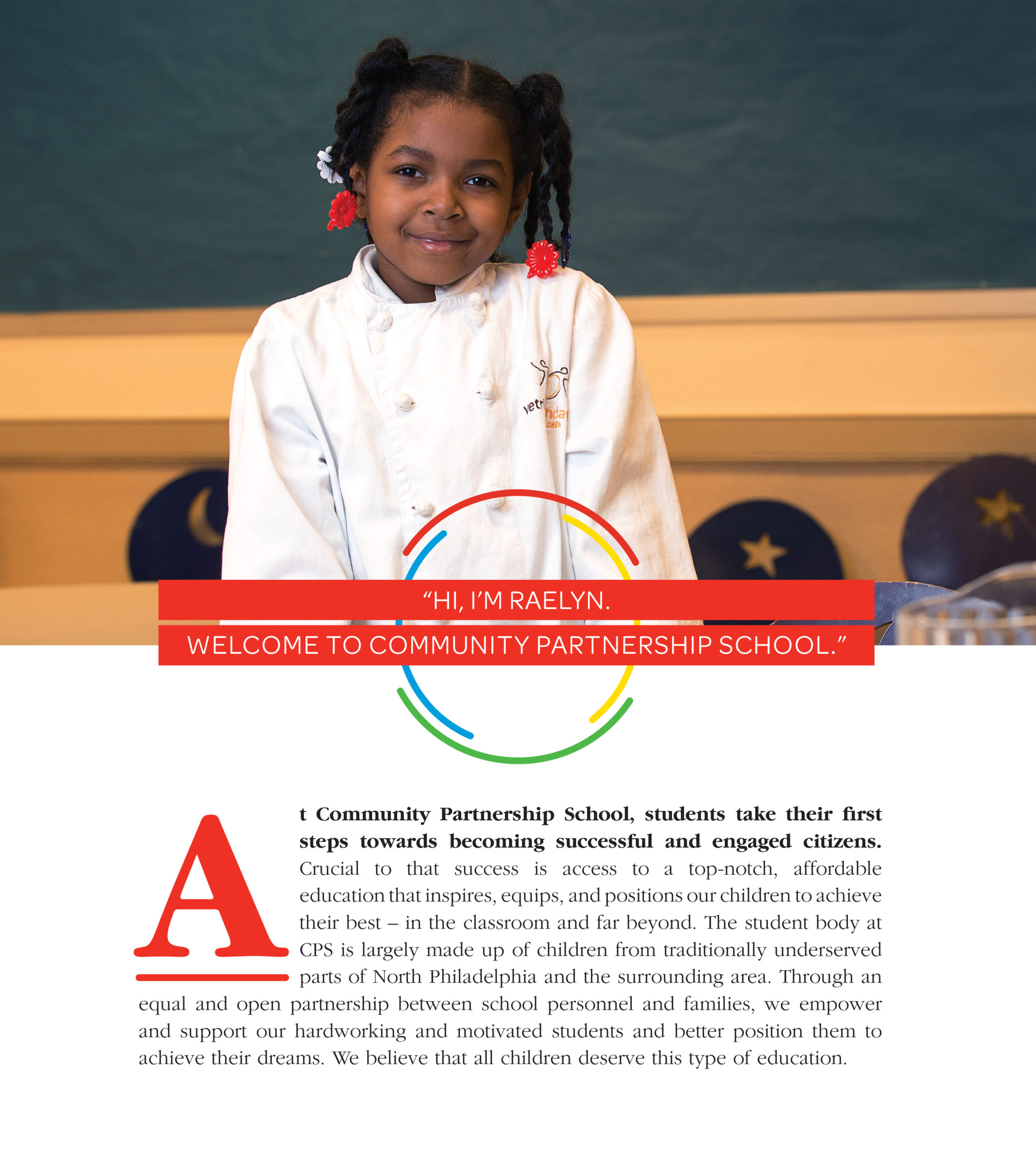
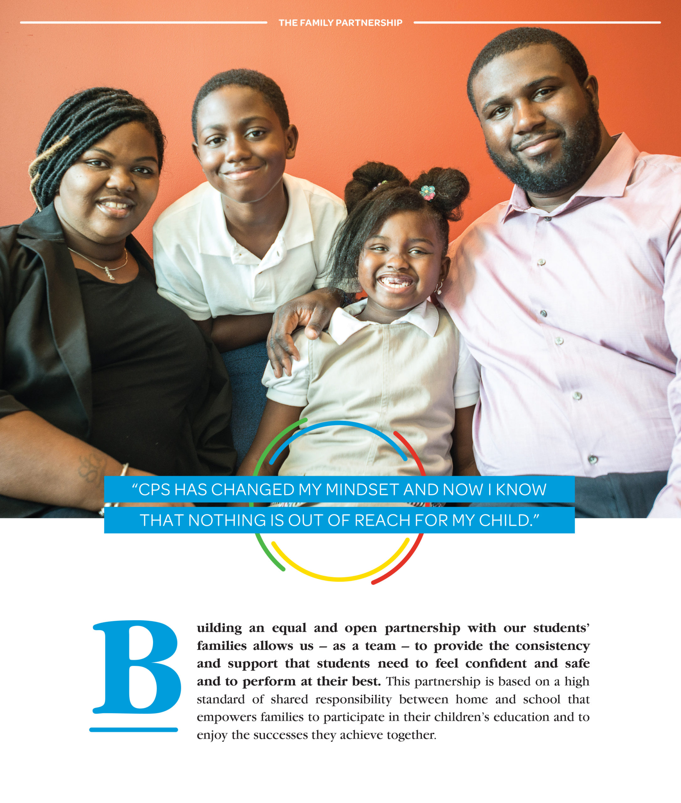
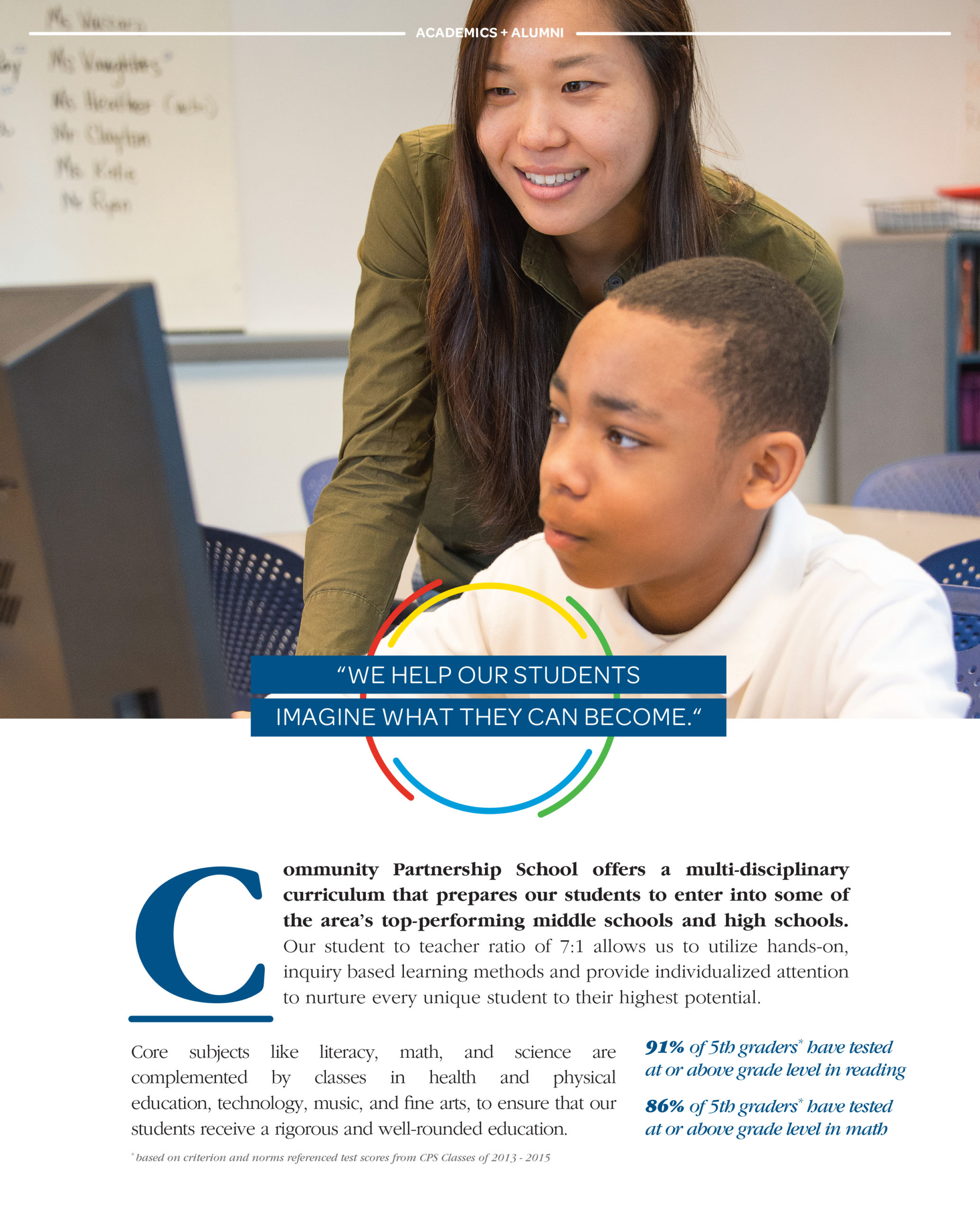
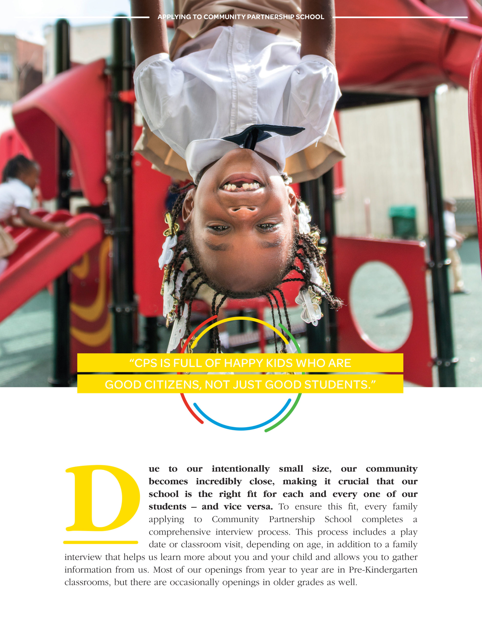
CPS represents a unique place in the landscape of Philadelphia’s public, private, and charter schools, offering a top-notch, affordable education to children from the underserved North Philadelphia neighborhood. The new brand drew inspiration from their unique approach of creating a strong partnership and shared responsibility among student, school, and family.
Industry
Components
Our first order of business was to hold stakeholder interviews with parents, teachers, board members, and neighbors (a.k.a. the “community” and “partners”) in order to uncover insights and perceptions that would imbue the brand with meaning.
Credits
Website: FormFunction
PROUD MOMENT
On December 14, 2018, we watched proudly (and maybe teared up a little) as Head of School Eric Jones cut the ribbon for the opening of Community Partnership School’s first building of their own, bearing a two-story version of its identity.